I took the feedback on the original posting to heart, specifically the following items:
there was an error in the graph, I misspelled a tag which caused ‘technology’ to be there twice
dead links were not visibe, this skewed the graph, this was remarked several times.
the legend was less than legible
I’ve corrected those elements in the graph and have put a new version of it in the place of the old one.
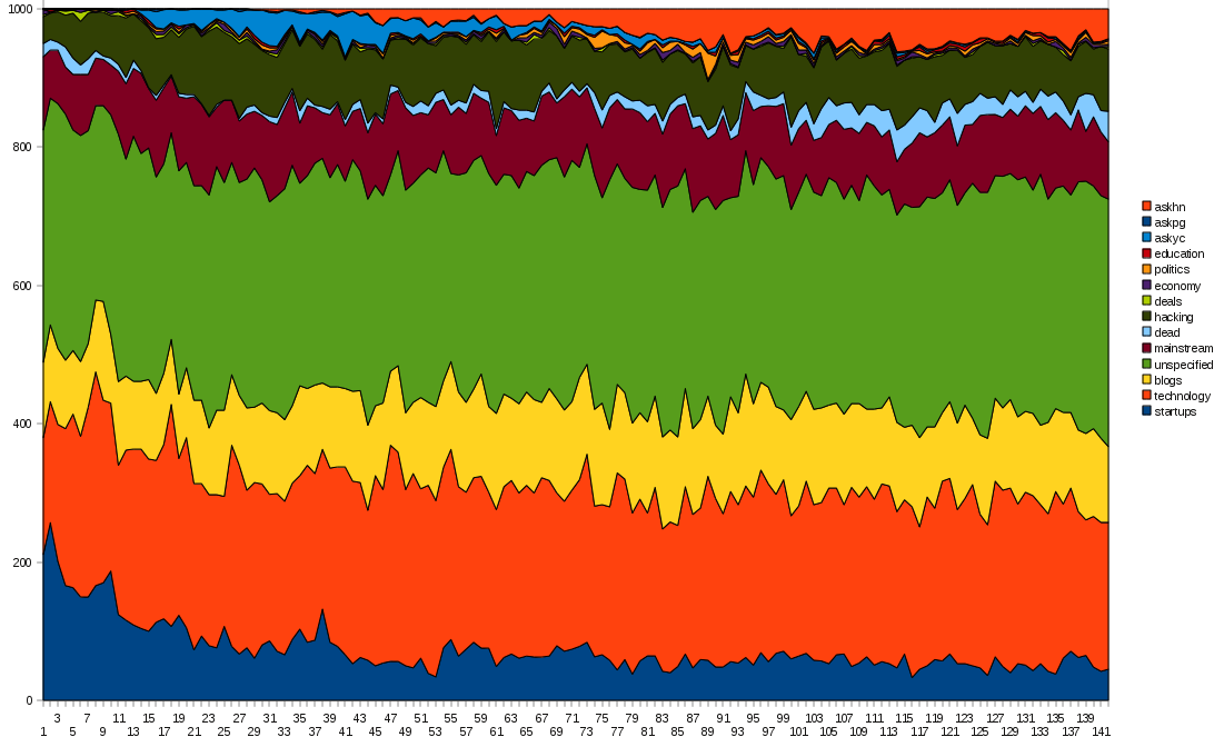
Click on the graph to zoom in.
In case it wasn’t clear yet, the ‘units’ for the axis are simply the rank number of the postings, 1000 postings vertically, blocks of 1000 postings horizontally. That makes the time-axis non-linear. A constant time axis would be a nice thing to have, I’ve tried to address that in the next graph below.
I think you can fairly easily make out the strong increase in ‘dead’ (as in killed by an editor or more than 10 flags before an item gets 10 upvotes), but after getting the first comments since roughly the 100,000 submission mark, it’s the light blue band in the top 1/3rd of the graph.
Other than the initial change of focus of HN from ‘startups’ to ‘startups+hacking’ it seems that that is the first hard proof that something is changing at all, even if it is just a relatively small change.
Other ‘dead’ posts are classified with the spam, so are not visible in this graph, the total spam volume at the moment is roughly 20% of all submissions!
Another shift is clearly visible near the top of the graph, ‘ask yc’ questions seem to have migrated to ‘ask hn’, with ‘ask yc’ now reserved for stuff that directly involves YC funded companies or alumni of YC.
Ntoshev makes an excellent and hard to refute point, which would require a completely different approach:
- “To me top 10 SEO tips for bloggers is not about technology at all, it’s about marketing. This is the category I feel is growing and it makes HN less interesting to me.”
I’m going to have to think about that and if it is possible to come up with a way to distinguish between these.
Goodside lists a number of points of interest:
- “Objectively ranked categories based on word usage, not author-provided tags”
That’s a really tough one, especially because ‘objectively’ seems to always mean something different to everyone, in spite of its name. Objective seems to mean ‘what I want to see’. Nthoshev is basically asking the same thing but in a way that it might be doable, which would essentially focus on a change of vocabulary in the submissions. Author provided tags are my objectively ranked categories, of course everybody is free to disagree with that.
But there is a chance that we can extract from the titles enough information to build up a vocabulary for a given interval, then compare how the current titles match the vocabulary from some arbitrary interval in the past. Obviously as technology develops there will always be changes in vocabulary so this kind of analysis is not without its problems.
The real discriminating factor would be to be able to identify links that scored ‘high’ but that would not have made it in the HN of old, that would be proof that HN is indeed changing.
- Legible graphs with fewer colors
I’ve tried to address the legibility issues, the ‘fewer colors’ is hard because of some of the smaller categories that I felt warranted inclusion.
- Analysis that weights comments by karma (or, better, a reasonable non-linear function on karma)
This is addressed in the graph below, except that the graph looks at submissions, not at comments.
- Open source for reproducibility and better outside critique
When this whole thing is done I’ll release all the data so you can do your own analysis, and I’m really curious what others will come up with.
The next graph is weighted by karma and has a linear timescale. The first three months of operations have been cut off, because the posting frequency was so irregular that it would skew the graph in ways that the rest would make no sense.
The ‘dead’ category is not present in this graph because it is weighted by karma and ‘dead’ submissions have a karma of 0.
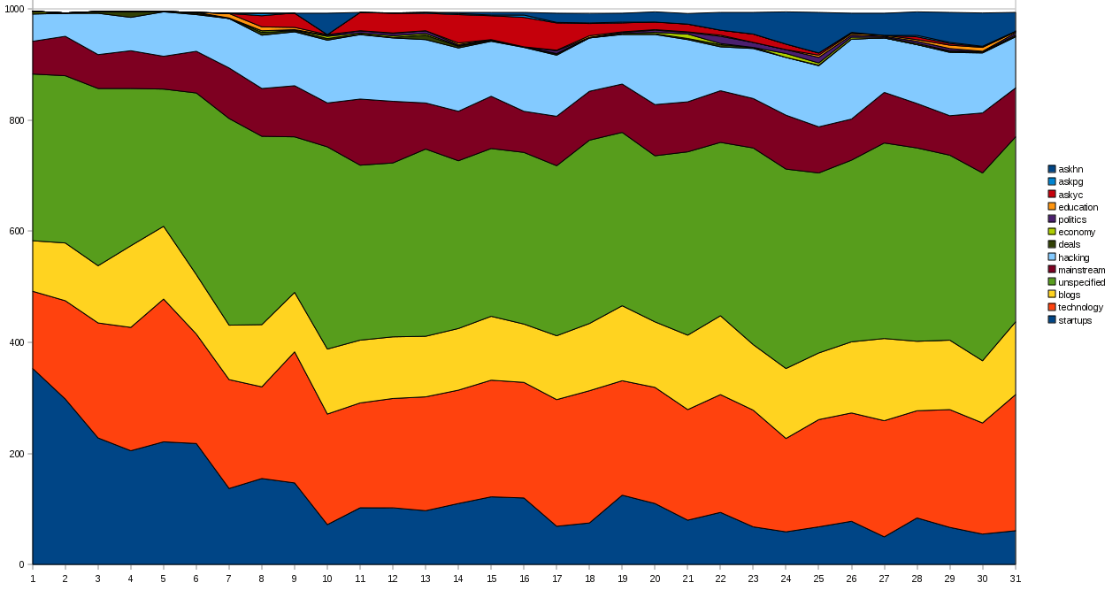
Click on the graph to zoom in.
The longer sampling interval (1 month horizontally) makes for a much smoother graph, the vertical axis is the sum of all the karma for that category with the total for the whole month scaled to 1,000.
I think that this is the first time that you can really see a trend develop, specifically how the long term frequency of startup material is getting lower and lower.
Thanks to everybody that supplied ideas on how to improve this little project, keep them coming!