Is HN changing ?
HN visitors are generally worried that HN is changing, and most of the worries center (obviously) around whether or not it is changing for the worse.
I thought it would be nice to either know that it really is changing or lay the matter to rest, so I sampled a bunch of postings done since HN was started and tagged them with a number of categories.
Of course I can't go through all of the items that have been posted through the years but it will give some insight.
Judge for yourself and see if you think there are obvious trends indicating long term change:
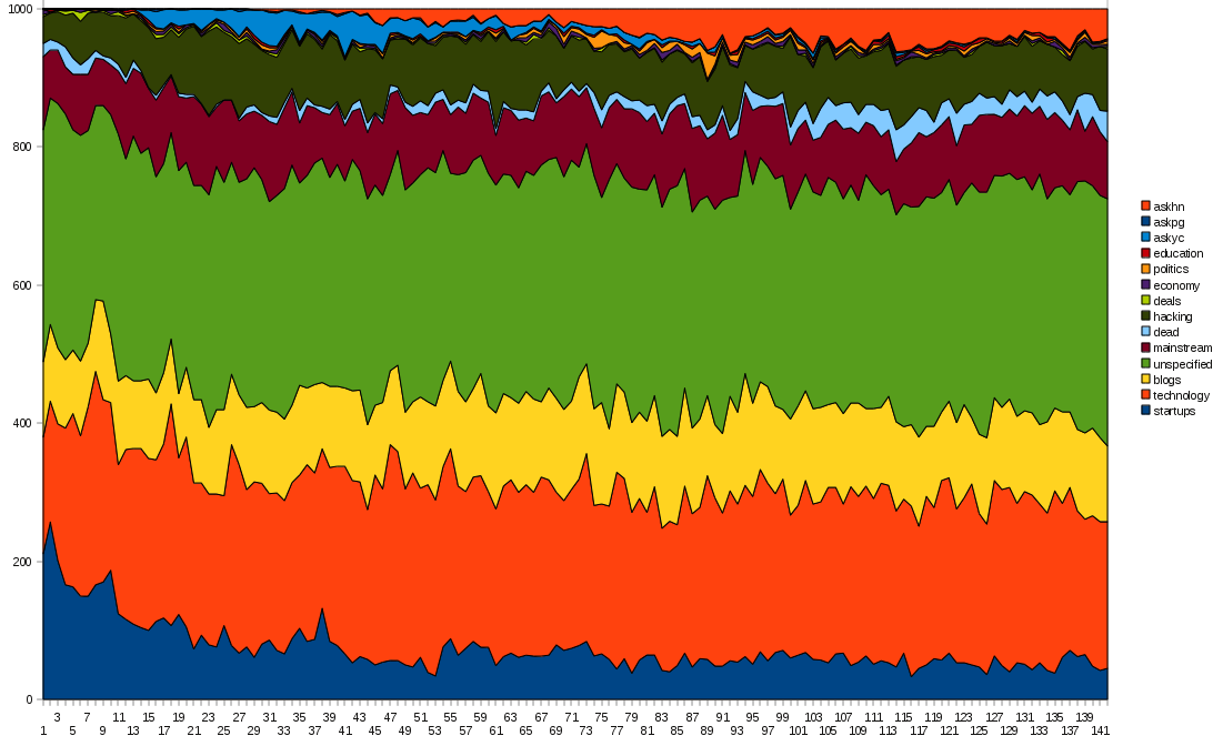
The image is larger than displayed here, if you click it you will see it full size.
With roughly 30% of the items not categorized there is some room for error, but on the whole it is my expectation that the 30% is spread relatively equally across the other categories.
- administrator's blog
- Login or register to post comments

axis & quality
The axis are in the Y direction a batch of 1,000 submissions, tagged and sorted in the same order for every batch, in the X axis the batch numbers.
The X axis is stretched considerably to make the graph more readable (the whole graph would be 138x1000 pixels).
As for the quality issues, I'll try to address those in a follow up posting, this is the 'raw' submissions we are looking at, minus the spam and the deleted posts, so think of it as a birds eye view of the 'new' page over time with 'showdead' off.
What are the axis?
What are the axis?
Submission Quality
One thing this graph can't account for is the quality of submissions. A technology article about 8051 assembly language is a lot different than a technology article about the top 10 SEO tips for bloggers.
how do we read a graph with
how do we read a graph with no units?
The units are 'rank'
So there are no units.
One element is one posting, 1000 units vertical and batches of 1000 horizontal.