HN has grown since the time that it was launched, but how much it has grown is dependent on which metric you use.
For the purpose of this analysis I’ve only looked at the users that actually contribute to HN, so that’s people that post and / or comment.
As far as I could resist the temptation I’ve tried not to analyze the graphs but to simply present them with some explanation of what you are looking at, I’m curious what kind of non-numerical trends you can pick out.
I’ve been scolded about not labeling my axis, unfortunately it seems that there is no easy way to do that so that it’s legible, so my apologies but you’ll have to read the text to understand the graphs. Another weird thing in open office (the software used to make the graph) is that the legend text is not kerned properly.
The first graph is the ‘active users’ of HN, on all graphs the x axis is per month.
An active users is defined as someone that has either posted an article or a comment in a given month.
Looking at this first graph I think it is safe to conclude that HN doubles in size for this metric roughly every year. How many people visit HN that do not contribute is not visible, but since we’re trying to gauge the effect on the atmosphere the only way that those people possibly could have an impact is by their voting patterns which are not visible to me. I hope that the number of people that only vote and do not post and / or comment is limited.
Interesting is the start of the real growth roughly a year after the launch, coinciding with a broadening of the scope of HN. (see the first installment).

The second graph shows the average karma per submission, this has roughly doubled since the launch, so the pay-off for people making lots of submissions is twice as high as it was in the beginning.

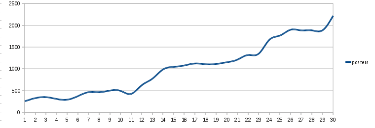
The third graph shows the number of active posters in a month. Interesting to notice here is that the number of active posters grows in spurts, then stabilizes. Presumably this is because a fairly large number of people join HN in groups and start posting.

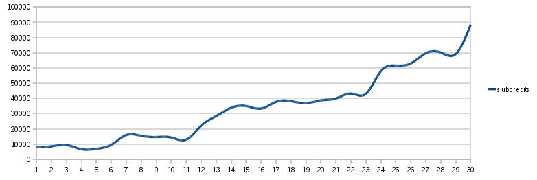
The next graph shows the total number of credits awarded to all submissions.

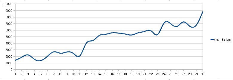
Then we get to the number of submissions per month. Since the beginning HN has not changed in format, even though the submission volume is now 9 times as high as it was originally. The net effect of this is that stuff is off the new page before a lot of people have had a chance to vote it up. On the other side of the ledger, there are more people visiting the new page, which will somewhat mitigate this effect.
Possibly it would be better to extend the length of the ‘new’ page because in practice once something moves to page 2 it is lost. It is very rare that something makes it to page 2 without enough upvotes and after that still collects enough votes to make it to the homepage, no matter how topical or interesting.

Next the total number of credits issued in a month. This clearly shows the karma inflation, in only 19 months the total karma issues per month has gone up 10 fold, much faster than the number of active users has grown. So that’s more people voting on more articles and comments.

Lastly the ratio of users that post articles as a fraction of all active users in a month, it seems that this is relatively steady around 40%, maybe slowly decreasing a bit but not much.
